Five Technology Things N° 1
Laws for spacecraft design; Competing with Excel; The original iPhone prototype; Build boring features; Your app is making me fat; Rants on the future of interaction design; Why publishers hate iOS7; Big things start as toys

Dave Akin’s Laws of Spacecraft Design
It’s remarkable how applicable this list is to strategy, especially the kind that impacts a large number of people in an organization. My favorite is rule #2:
“To design a spacecraft right takes an infinite amount of effort. This is why it’s a good idea to design them to operate when some things are wrong.”
There’s more humor in this list than there is in Kelly Johnson’s list, and more about the specific workings of a design team. Read them all. I suspect you’ll enjoy #32, and I believe a majority of our work in the future will build upon the truth contained in #15.
NB: I love a list of rules. I hope that someday I can have a list of rules that people attribute to me. Even if that list of rules is about burger-eating.
Everything competes with Excel

Email and Excel are two of the most formidable software competitors ever: people use them to do just about everything. Yet we don’t often think about them as competitors because they don’t compete directly…they compete indirectly by being flexible tools you can use for almost anything.
Last night at the futureofwork.co event, Stowe brought up a good point: that “enterprise” is a really good way to sell software, but a really bad way to use software. Further, it’s clear that in our work, the Excel problem rings true even outside the software environment: existing behaviors and tools are the biggest enemies to change.
The Original iPhone Prototype


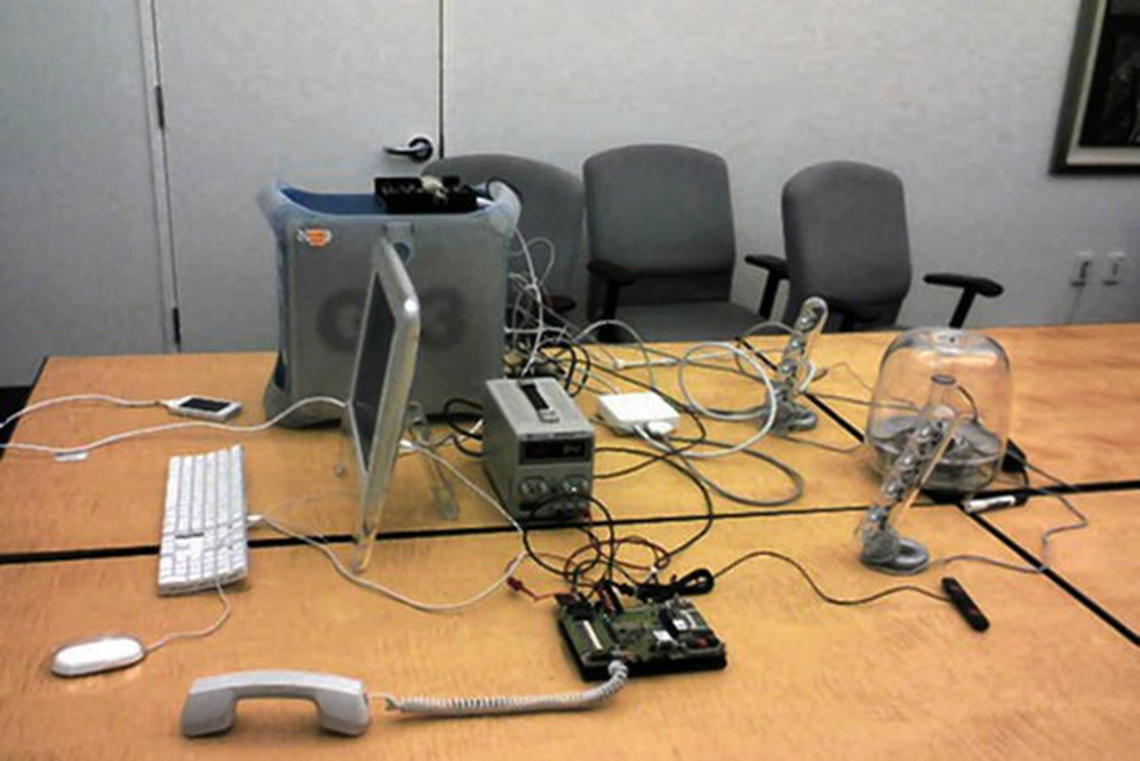
The Wall Street Journal ran a great story yesterday about the early days of the iPhone. It’s worth a read, but if you’re crunched for time, just grab the picture above. It says so much. It’s from 2006, and shows the early prototype of the iPhone: a touch screen interface, tethered to a Mac, with an ACTUAL phone, speakers, and a rat’s nest of cables.
I dunno about you, but that gives me chills.
Build Boring Features
Take issue with the term “Growth Hacker” all you want. This is smart stuff from Alex Godin. Currently in action at the Hyatt DX Lab.
Get everyone on the team in a conference room and brainstorm 50 small things you could ship to grow your product. Do it tomorrow. Be sure you write down pop the small, boring, features because those are the ones you need to do first.
The features that grow numbers aren’t the massive endeavors you grow accustomed to while building a product from scratch. The pieces that make a difference are things like better sharing buttons and new ways to close the viral loop. Adding the “Sign in with Google” button to the Dispatch homepage was one of the biggest features we ever shipped. Total time to build it? 8 hours.
Also: I’m loving the new SVBTLE design. Good stuff. Link now broken
Your app is making me fat

The whole article is worth a read, but if you’re too lazy to click at the end, here’s the important part:
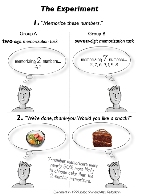
Willpower and cognitive processing draw from the same pool of resources. Spend hours at work on a tricky design problem? You’re more likely to stop at Burger King on the drive home. Hold back from saying what you really think during one of those long-ass, painful meetings? You’ll struggle with the code you write later that day.
Since both willpower/self-control and cognitive tasks drain the same tank, deplete it over here, pay the price over there. One pool. One pool of scarce, precious, easily-depleted resources. If you spend the day exercising self-control (angry customers, clueless co-workers), by the time you get home your cog resource tank is flashing E.
Cognitive resource tank don’t care.
A brief rant on the future of interaction design

There is so much good in this rant. "Pictures under glass" is nice. So is the bit about the four fundamental grips (learning!). That the iPad was imagined in 1968. The importance of research & vision. But I think this is important: Needs vs. Technology vs. Capability.
In this rant, I’m not going to talk about human needs. Everyone talks about that; it’s the single most popular conversation topic in history.
And I’m not going to talk about technology. That’s the easy part, in a sense, because we control it. Technology can be invented; human nature is something we’re stuck with.
I’m going to talk about that neglected third factor, human capabilities. What people can do. Because if a tool isn’t designed to be used by a person, it can’t be a very good tool, right?
I think at UC we’ve focused mostly on the latter. Accidentally, probably, but that’s a happy accident.
Why publishers hate iOS7
For an Apple design, the Newsstand icon looks decidedly juvenile. But what’s worse for publishers is that there is now no visual reminder within the Newsstand icon that there are publications inside, waiting to be read. On top of that, in iOS7 users can now hide the Newsstand icon inside a folder. The once-special treatment that Apple gave publishers in order to encourage the distribution of magazines to the iPhone and iPad had apparently vanished, at least in terms of visual prominence.
Now, Fleishman is worried that, without the visual cue, readers might be forgetting that his publication even exists. “I get email regularly from readers who say that they forget that issues come out,” he says.
This confirms a behavior that I’ve noticed in myself: I’m reading The Economist less frequently than I have in the past. It used to be a weekly read, and I thought it was one of my more durable habits.
Funny how much a design change can do. Link broken
Big things start as toys

The reason big new things sneak by incumbents is that the next big thing always starts out being dismissed as a “toy.” This is one of the main insights of Clay Christensen’s “disruptive technology” theory. This theory starts with the observation that technologies tend to get better at a faster rate than users’ needs increase.
Disruptive technologies are dismissed as toys because when they are first launched they “undershoot” user needs.
This does not mean every product that looks like a toy will turn out to be the next big thing. To distinguish toys that are disruptive from toys that will remain just toys, you need to look at products as processes.
Wikipedia is literally a process – every day it is edited by spammers, vandals, wackos etc., yet every day the good guys make it better at a faster rate. If you had gone back to 2001 and analyzed Wikipedia as a static product it would have looked very much like a toy.
So much good here.


Comments